I shop at a supermarket that has the new electronic cashiers. I’m actually fairly bemused at their efforts. At least 30% of the times I’ve used it, the darn thing has had to be babysat by a human cashier. However, even when it does work, it has a really awkward design that I consider absolutely unforgivable.
First, let me show you what it looks like:
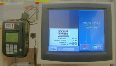
The unit on the right is the main touchscreen panel. You use this for all your interaction. The unit on the left is a small, standard-issue supermarket card reader with a swipe and a small touchscreen. It is identical to the ones they use at the normal cash registers.
The problem is pretty basic: You use the big color screen for almost everything, until it comes time to pay.
Fair enough. Use the card reader for swiping the debit card and entering the code. It’s slightly more secure that way, and it probably requires simpler (i.e. less buggy and more secure) code to turn it over to the small keypad.
However, the system doesn’t delegate the entire payment process to the card reader. You start with the display you see in the photo. Remember that you have been using the big color monitor for the last five minutes to scan all your groceries. You are standing in front of it and getting all your queues from that display.
When it comes time to pay, the big display asks you for a payment method. I usually use a debit, so I click on the “Debit” button. I am then presented with the display that you see in the photo, where it says to use the keypad. At this point, I experience a slight “face plant” (face plant number one). This is where I go “huh?” and look for the keypad. Note that the big display refers to it as a “PIN Pad.” This is face plant number two. Different manufacturers and stores use different equipment. Most of the modern ones have the card swipe and keypad in the same unit, but older ones would have separate units. It’s quite possible that the instructions would be in a display separate from the PIN entry keypad. I think the terminology is awkward. They should display a photo or drawing of the unit.
Now, I’m pretty sure that these cashier systems were designed to mesh with a number of different keypad systems, and that is one of the reasons for the awkward terminology. Nevertheless, there has got to be a gigantic amount of work in installing and customizing each unit. Part of that customization should be the selection of a module that displays the appropriate image.
In any case, that’s water under the bridge. I’ve found the “PIN Pad,” and I’m reading the little display (The big display says I should follow the instructions on the little display.) I swipe the card, type in my PIN, and wait. The PIN Pad display says something like “Processing…”
What I don’t know, is that now the large display is displaying a cash back prompt, and showing a number of buttons. I’m standing in front of the PIN Pad, like a idiot, waiting for the display to change. This is completely different from the standard routine at a normal cashier. In those cases, the little display has the same message, but the cashier then asks you for the cash back amount. Your attention never leaves the display.
Remember that all my attention is now on the little display. This is a very bad face plant (face plant number three). I have used the same system many times over, and yet I constantly go through the same thing. I am no dummy. Some other customer may have the routine down pat, but I don’t.
The control flow is suddenly shifted away from the small keypad.
This is especially bad, as you have to move your entire body, and redirect your attention. It completely slaps you out of your “mode.”
Suggested Solution:
Have the main display ask for the cash back amount before turning you over to the PIN Pad.